clusterclub.com
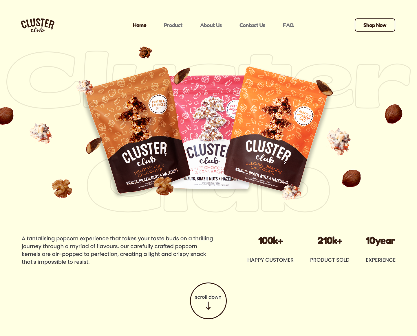
HomepageThe hero arranges the three Cluster Club flavours over an oversized brand wordmark watermark, with the brand stats anchoring the bottom.
Taking a snack brand from zero digital presence to a fully live, shoppable e-commerce site - designed and launched fast.
HomepageThe hero arranges the three Cluster Club flavours over an oversized brand wordmark watermark, with the brand stats anchoring the bottom.
Cluster Club is an e-commerce brand that came to Fuze Studio with no website. They had a product ready to sell but nowhere to sell it from. My job was to take them from zero to a fully live, shoppable site.
Without a digital home, Cluster Club had no way to communicate the brand or to convert interest into orders. They needed a site that looked credible, felt on-brand, and turned visitors into buyers - built and launched fast.
I worked in three clear stages so the design decisions sat on top of a real understanding of the brand and the buyer flow - not the other way around.
01 - Discovery
Who Cluster Club's customers are, what feeling they wanted to create, and what similar brands in the space looked like. This gave me a clear direction before opening Figma.
02 - Wireframes
I laid out the key pages and the user flow first - homepage, product page, checkout. The goal was to make the path to purchase as frictionless as possible.
03 - Design
The full site in Figma - clean layout, strong product imagery, clear calls to action. Every decision was checked against one question: does this make it easier to buy?
SitemapThree primary nav buckets at the top (Shop / Our Story / Help) - the pages a shopper actually browses. The purchase flow is shown separately because Cart and Checkout are triggered states, not nav destinations. Footer holds the legal/trust layer.
User FlowLand on Home → browse Shop → pick a flavor → add to Cart → enter Checkout → done. Six steps from intent to ordered. Wireframing started from this spine.
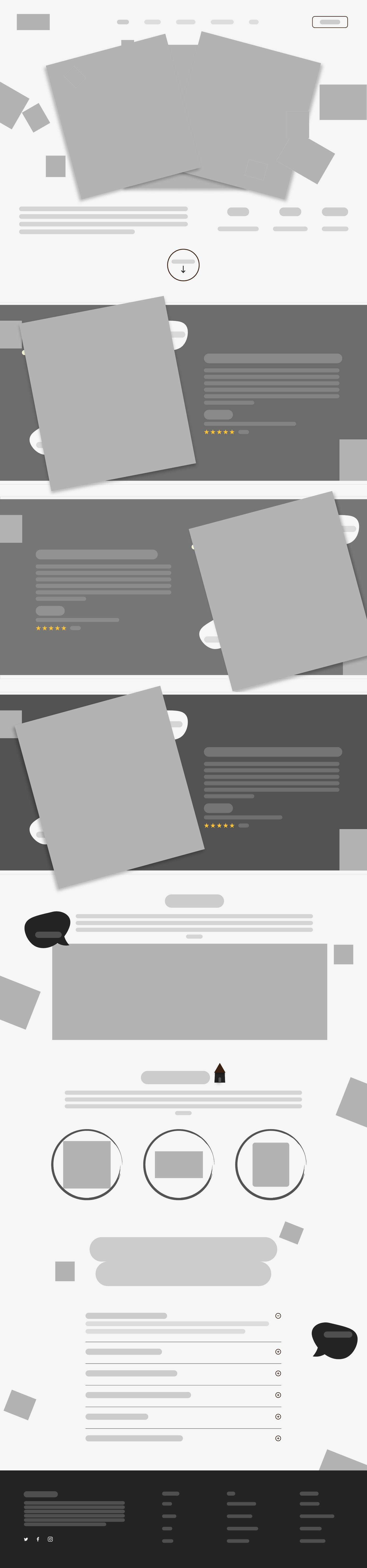
↑ scroll inside the frame to see the full wireframe ↓
Mid-fi wireframeHero with three angled product placeholders, alternating product sections, About + chat cue, FAQ accordion, multi-column footer. Layout and visual arrangement decisions both locked in gray before color, type, or imagery joined the conversation.
Style systemOne palette, three type sizes, and a handful of components that the whole site composed from. Locking these early kept every page consistent without slowing the build.
Every design decision was made with one question in mind: does this make it easier for someone to buy?
Rather than a generic grid, each flavour gets a full-width colour band of its own. The product photography, price, rating, and category breadcrumb all sit on a background that matches the bag - so a quick scroll feels like flipping through the lineup.
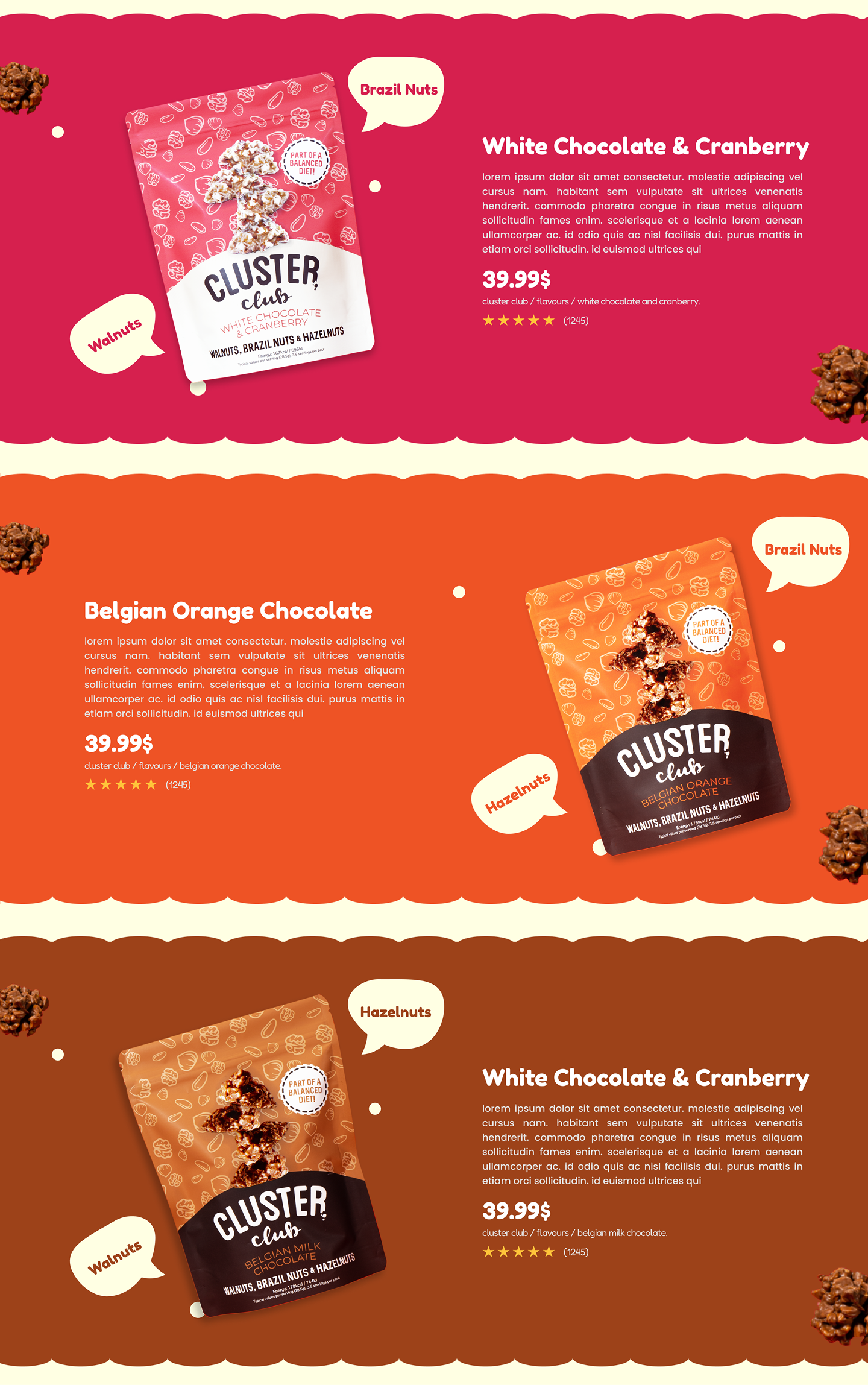
Product detailThree flavours, three colour bands, three identical price/rating modules. Repetition is the system.
The brief was "make it easy to buy" - so the checkout reuses the flavour-band system instead of inventing new chrome. Same form, same progress indicator, same Confirm Payment CTA; only the colour and product card change. The buyer's brand-colour memory carries from catalogue to confirmation.
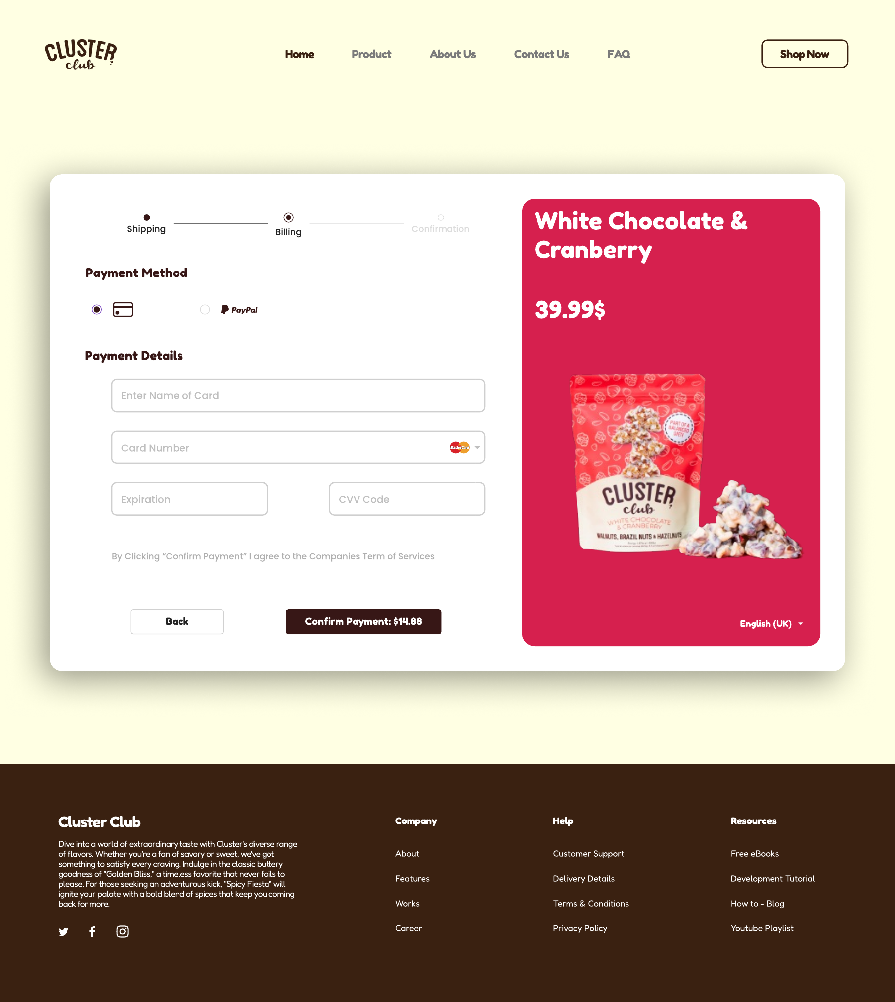
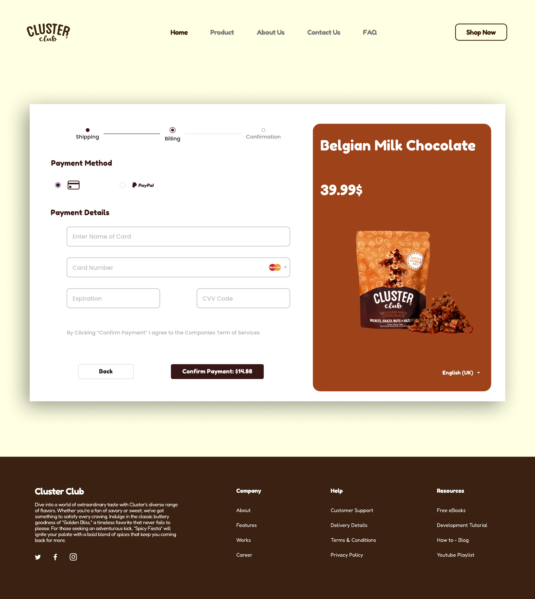
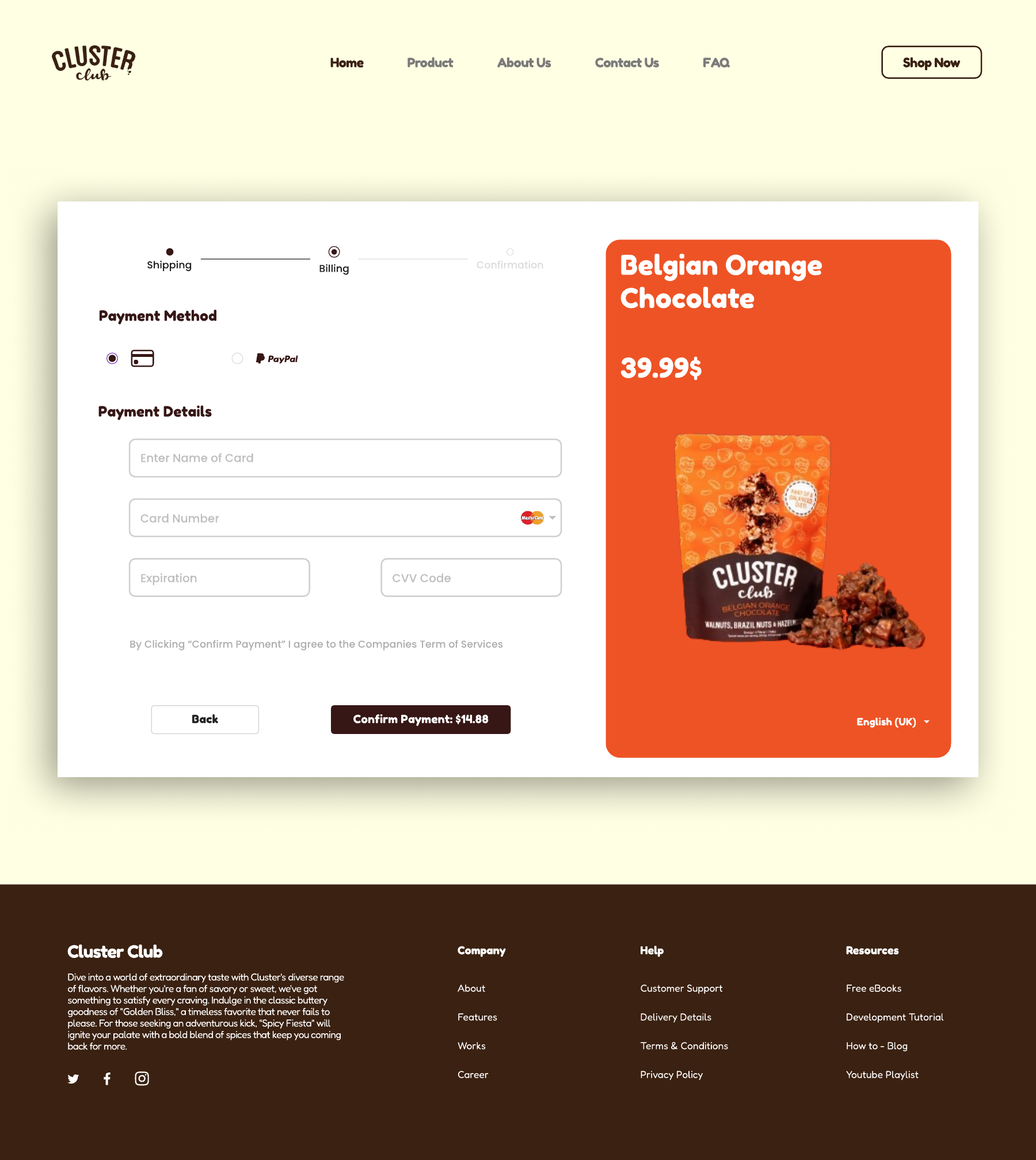
Checkout, three flavoursSame form, three brand-colour bands. The system proves itself at the buying moment.
Visitors who land on a brand-new site need quick reasons to trust it. The About Us section pairs the product lineup with the brand story; Our Stores lists the major retailers carrying Cluster Club - a fast credibility cue without needing testimonials yet.
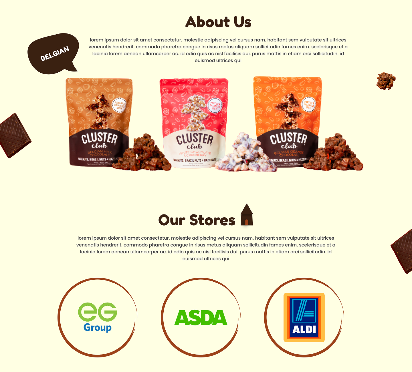
About & Our StoresEG Group, ASDA and Aldi logos answer the unspoken "is this real?" question on first visit.
An accordion FAQ at the bottom catches the common pre-purchase doubts - returns, billing, account - before the user has to dig for them. The footer keeps the navigation tight and groups company / help / resources in three clean columns.
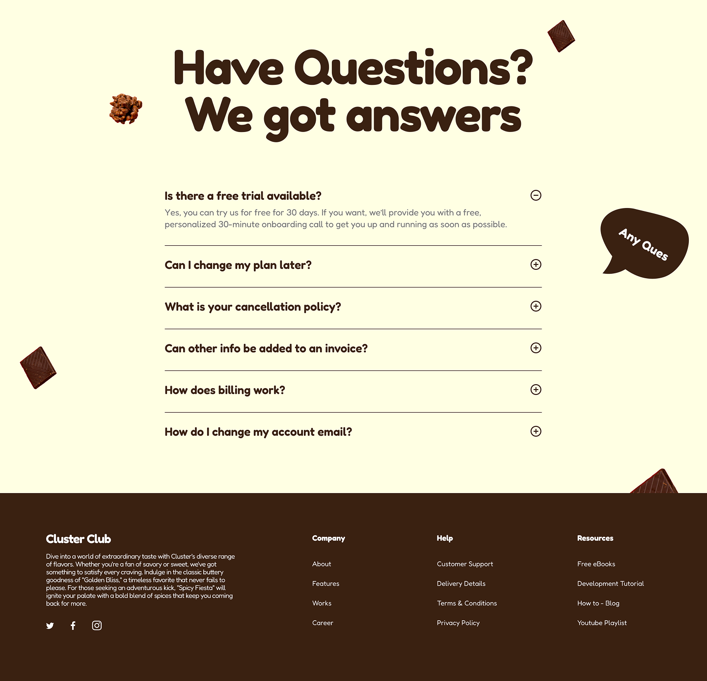
FAQ & footerOne open answer up top sets the pattern; the rest stay collapsed so the page stays scannable.
Cluster Club went from having no online presence to a fully live e-commerce website. The client was happy with both the speed of delivery and the final product - calling the result exactly what they envisioned.
Tania's ability to grasp our idea was next to none. She understood what we needed and delivered in a timely manner. Really pleased with the finished website and service.
This project reinforced how important it is to nail the user flow before designing screens. Getting the structure right early meant fewer revisions, a faster build, and a final site that did the one job the brief asked for - make it easy to buy.
If you're hiring and want to dig into any of this - what worked, what I'd change next time - drop me a note. I'm always up for a critique.